What are some different ways we can show
data? The 4th graders
practiced making different types of graphs and calculated percents in this
activity. We learned a lot about graphs
and data…and we got to eat our M&M’s! ![]()

First, each student had to decide which color
M&M was their favorite: orange, blue, green, brown, yellow, or red. They colored in their M&M character, and
as a class we created a pictograph. A
pictograph uses pictures or symbols to represent data. ![]()
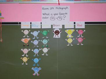
Key: 1 M&M is equal to 1 vote.
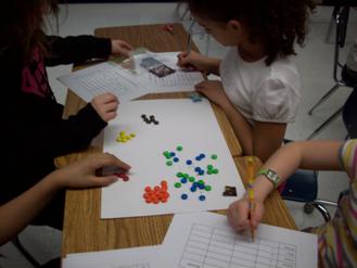
Then students were challenged to estimate how many
of each color M&M’s were inside the bag.
The students then opened the bag and filled in their data chart with the
actual number of each color M&M’s.
The students figured out the total number of M&M’s in the bag and
figured out the fraction for each color.
Then we used division to find the percent of M&M’s that were
specific colors. We compared our
percents to the data on the official M&M website that tells what percent of
M&M’s are produced in various colors. ![]()
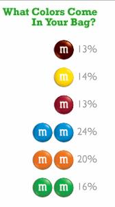
Data
from www.m-ms.com
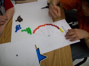
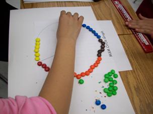
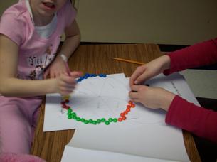
After all that calculating, it was time to make
our pie chart, or circle graph. The
students arranged their M&M’s by color around the circle graph and then
divided up the graph accordingly. After
completing the circle graph, students used numbers from their data chart to
create a bar graph. ![]()
The
4th graders did a great job using different types of graphs to show
their data!
 Back to Mrs. Kanas’s Classroom Homepage